Самоучитель CSS Справочник CSS Селекторы Стили по умолчанию Цвета CSS Единицы измерения
Свойства CSS
align-content align-items align-self animation animation-delay animation-direction animation-duration animation-fill-mode animation-iteration-count animation-name animation-play-state animation-timing-function backface-visibility background background-attachment background-clip background-color background-image background-origin background-position background-repeat background-size border border-bottom border-bottom-color border-bottom-left-radius border-bottom-right-radius border-bottom-style border-bottom-width border-collapse border-color border-image border-left border-left-color border-left-style border-left-width border-radius border-right border-right-color border-right-style border-right-width border-spacing border-style border-top border-top-color border-top-left-radius border-top-right-radius border-top-style border-top-width border-width bottom box-shadow box-sizing caption-side clear clip color column-count column-gap column-rule column-rule-color column-rule-style column-rule-width columns column-span column-width content counter-increment counter-reset cursor direction display empty-cells filter flex flex-basis flex-direction flex-flow flex-grow flex-shrink flex-wrap float font @font-face font-family font-size font-size-adjust font-stretch font-style font-variant font-weight height justify-content @keyframes left letter-spacing line-height list-style list-style-image list-style-position list-style-type margin margin-bottom margin-left margin-right margin-top max-height max-width min-height min-width opacity order outline outline-color outline-offset outline-style outline-width overflow overflow-x overflow-y padding padding-bottom padding-left padding-right padding-top page-break-after page-break-before page-break-inside perspective perspective-origin position quotes resize right table-layout text-align text-decoration text-indent text-overflow text-shadow text-transform top transform transform-origin transform-style transition transition-delay transition-duration transition-property transition-timing-function unicode-bidi vertical-align visibility white-space width word-break word-spacing word-wrap z-index

perspective

Поддержка браузерами

12.0+ 10.0+ 16.0+ 36.0+ 23.0+ 9.0+

Описание

CSS свойство perspective определяет, на сколько пикселей удален 3D элемент от точки обзора. Это свойство позволяет изменять перспективу, откуда просматриваются 3D элементы.

При определении свойства perspective для элемента, перспективный вид получают именно дочерние элементы, а не сам элемент.

Свойство perspective воздействует только на 3D трансформированные элементы.

Используйте это свойство вместе со свойством perspective-origin, которое позволяет изменять нижнее положение 3D элементов.

Значение по умолчанию: none
Применяется: к трансформируемым элементам
Анимируется: да
Наследуется: нет
Версия: CSS3
Синтаксис JavaScript: object.style.perspective=500

Синтаксис

perspective: число|none;

Значения свойства

Значение Описание
число Указывает на сколько пикселей элемент удален от точки обзора.
none То же самое, что и 0. Перспектива не установлена.
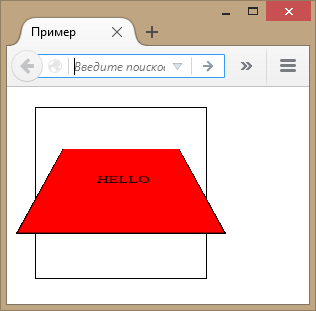
Пример

<!doctype html>
<html>
<head>
  <meta charset="utf-8">
  <title>Пример</title>
  <style>
    #div1 {
      height: 150px;
      width: 150px;
      margin: 20px;
      padding: 10px;
      border: 1px solid black;
      perspective: 150px;
    }
    #div2 {
      padding: 50px;
      border: 1px solid black;
      background-color: red;
      transform: rotateX(45deg);
    }
  </style>
</head>
<body>

  <div id="div1">
	<div id="div2">HELLO</div>
  </div>

</body>
</html>

Результат данного примера в окне браузера:

perspective
Копирование материалов с данного сайта возможно только с разрешения администрации сайта
и при указании прямой активной ссылки на источник.
2011 – 2024 © puzzleweb.ru | razumnikum.ru

Реклама на сайте | puzinfo@puzzleweb.ru | ruen